Recently I have stumbled across some interesting data. I swear, I was not even looking for it, my initial goal was to see where would be a suitable place for me to live in England that would have the best health stats. But then I stepped onto a gold mine. Who would have known!
There are two pieces of statistics that NHS collects and publishes every year or every couple of years. One is on diabetes rates by local authority, that can be found on Nomis website.
Another one, is the activity rates by local authority that can be found here:
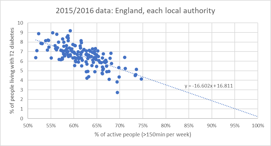
What I have done for the graphs below is I have plotted one statistic vs the other i.e. the percent of people being active in the region (local authority) vs the percent of people with T2 diabetes in the same region. Then plotted the data for (because it was the easiest for formatting reasons). Without any further analysis there appears to be a clear trend.

What I found absolutely fascinating is what happens when the line is extended… Let’s look at what happens if our linear prediction is right. What if 100% of people engaged in >150min of exercise each week? Well, the diabetes rate would drop to almost 0%. Isn’t it absolutely amazing if it is true?
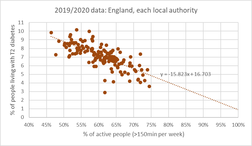
The trend persists when I plot the 2019/2020 data.
The moral of the story
We are being fed a lot of information about how certain diets and restrictions can solve the diabetes problem. Good example of that is keto. Some people (Glucose Goddess) say to drink the disgusting apple cider vinegar before each meal. I am not denying that dietary changes can help, but I believe the dietary impact is overrated. Seeing the data presented in this blog I am now convinced that exercising can make a much more significant impact on resolving the diabetes crisis.
I would love to hear your opinion on this? Does seeing this data motivate you to do more exercise?

Leave a comment